Aer Lingus App
Year
2017 -2018
Deliverables
- Home screen UX redesign
- Personalisation
- Conversion optimization
- Fixing of major user pain points
Booking a flight should be simple, fast and a delightful experience.
In my role as Senior Mobile Product Designer in Aer Lingus, I worked on the Mobile App for both iOS and Android. In the current app, we started seeing some major usability issues early on. To dive deeper into these usability issues, I conducted user testing at the airport to identify the source of the problem. After watching users going through the process of booking a flight, we quickly identified the main user pain points.
Time is money and the booking flow was long and clunky. Mobile users are all about speed and convenience. I did a deep dive in the user flow and optimized all opportunities to shave time off the booking process.
During our usability deep dive we quickly identified the main user pain points:
- The Airport selection is unclear and focus is on the airport code. (Problematic as the majority of users don’t know airport codes).
- The saved searches icon on the top right isn’t obvious and brings user off the booking screen.
- The date selector is two buttons for one action. Sending users is an endless loop, as when the user presses the second date button the dates are reset.
- Passenger Selection is an unknown paradigm. Add Children or Infants text is too small. Doesn’t meet the minimum criteria for iOS and Material guidelines.
- Saver or Business button isn’t needed in all cases as Business is only available on long haul flights.
Home Screen
Before and After
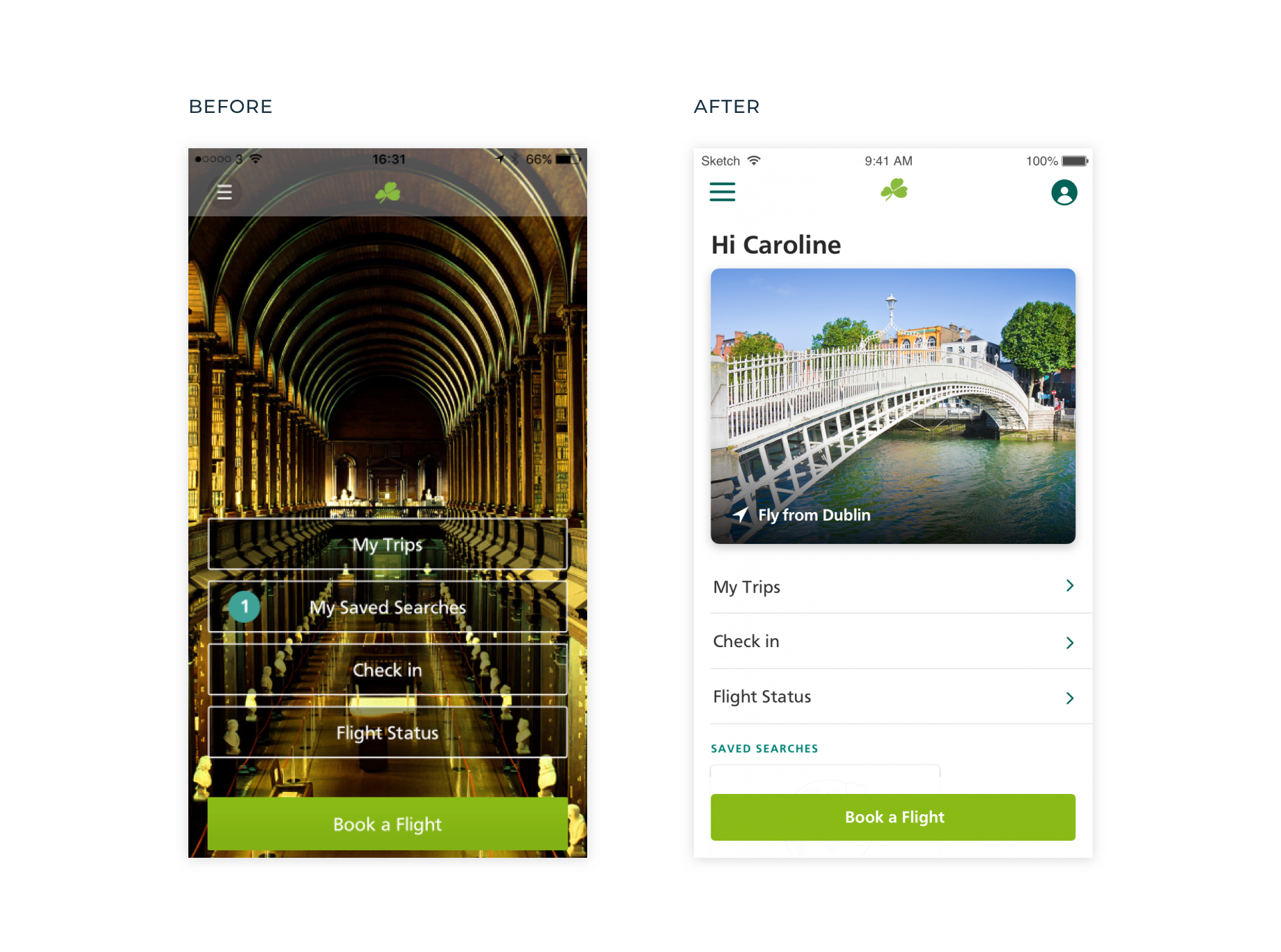
Illegible text on buttons. Extremely poor accessibility for users with impaired vision.
Dark/Dull uninviting imagery. Shows me an image of Dublin when I’m in Dublin, this doesn’t inspire me to book a flight.
Not on brand.
No personalisation or context of where I am in the app.
Main CTA is lost on this very busy screen
Clean, bright and inviting
Personalisation, makes user feel important.
Easy access to your account
Home card, changes depending on status. If you have a trip, flight details will appear here.
CTA now clearly visible.
Buttons legible and accessible.
Search Flights
Before and After
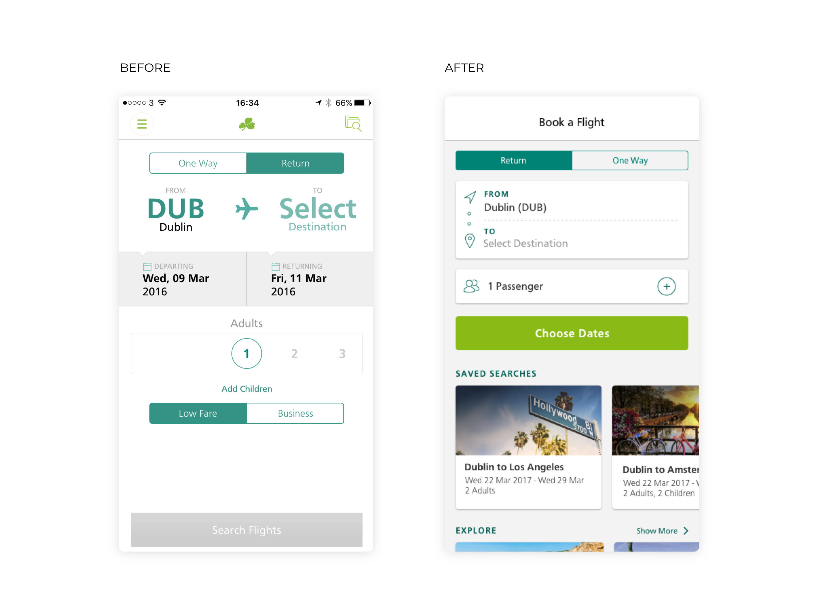
Emphasis on airport codes, users generally don’t know these unless you are a frequent flyer.
Not obvious what this button does. Saved flights are here, out of sight out of mind, this feature had very little engagement.
Two buttons for one action. Major user pain point as you have to select both dates on the calendar. It resets when return button is selected leaving users frustrated in an endless loop.
Unknown paradigm, carousel selection caused confusion for users.
Touch area for adding children is too small. Doesn’t meet iOS minimum target area size.
Button should be active and highlight any errors on press. Users can be left confused if button remains inactive.
Focus on Destination name improves ease of use.
New passenger modal is a known paradigm and solves a user pain point.
Choose dates in the next step, this saves user unnecessary steps and makes it easier to change dates.
Saved/recent searches given more emphasis. Allowing users to easily price watch and share with friends.
Calendar View
Before and After
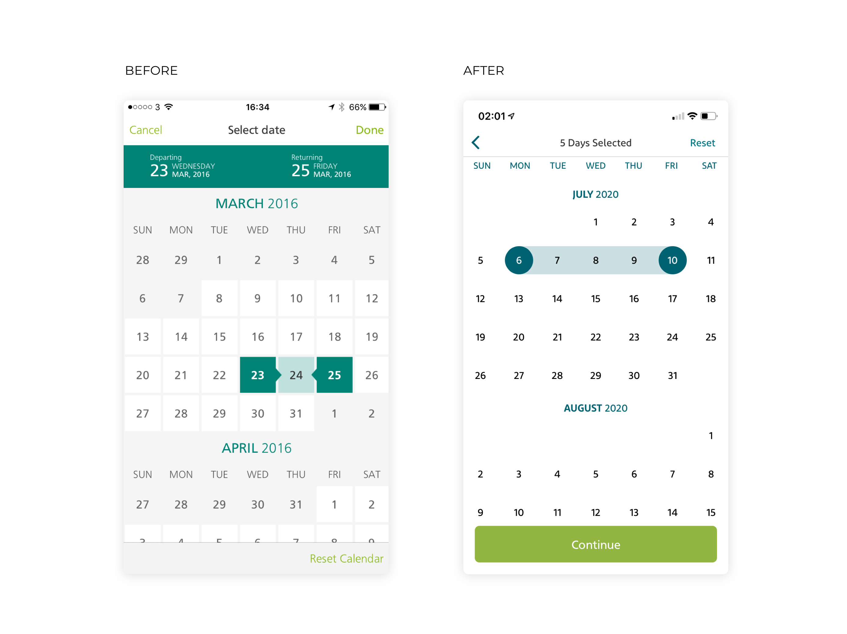
Two buttons for one action, causing major frustration for users.
Done button isn’t obvious enough to user.
Repetitive day view, makes the UI look clunky and busy.
Users often press Reset Calendar instead of Done. Major pain point for users.
Pinned day view, saves space and is obvious as you scroll.
Reset button moved to top right.
Large CTA appears when dates are selected.
Information on what to do and how many days selected shown here.
Flight Results
Before and After
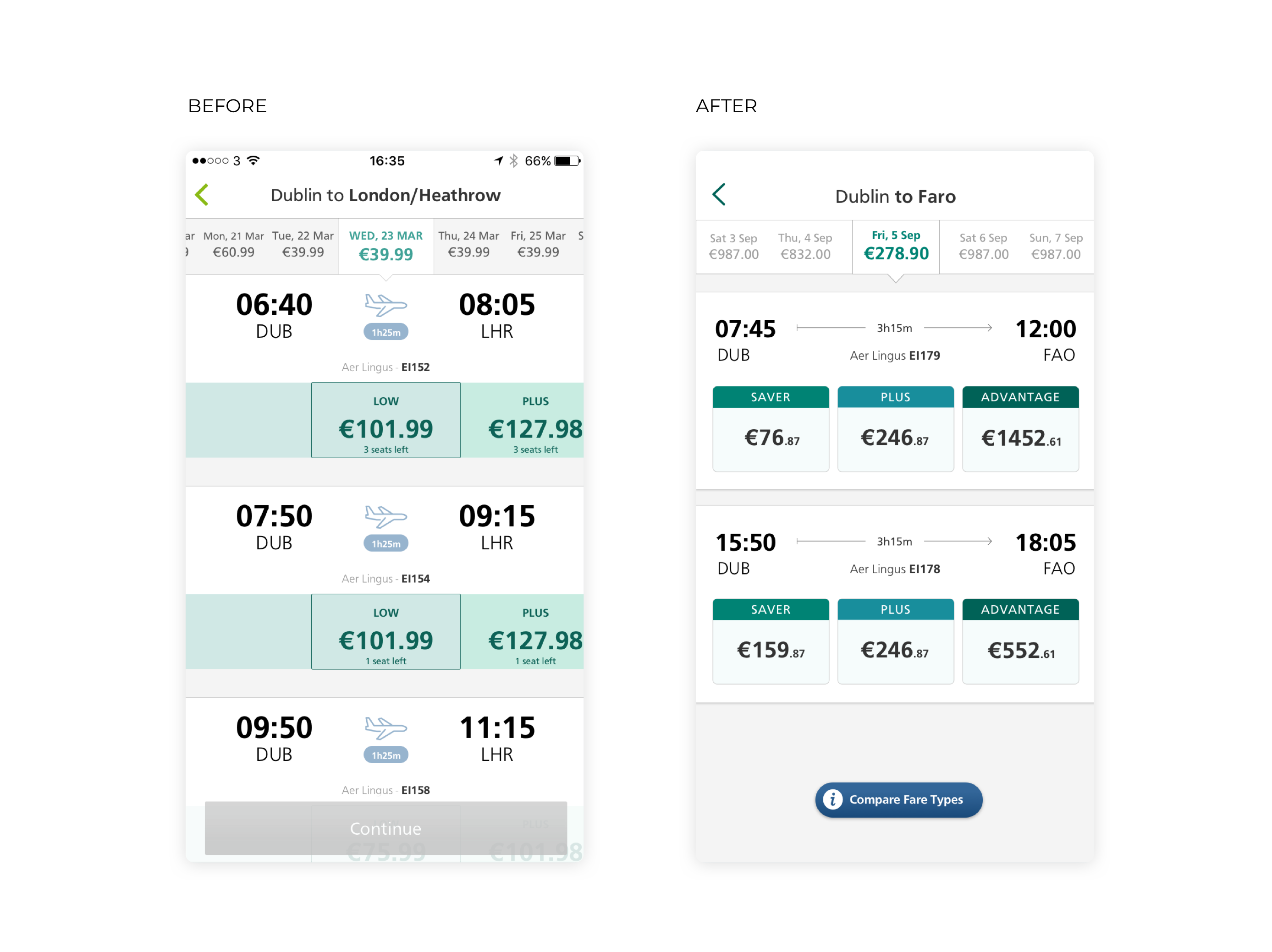
No seperate of content, very hard to distinguish between the different flights available on a given day.
Focus on cheapest flight, all fare types should be visible so user can easily compare.
Disabled button restricts view and adds additional step.
All fare types visible without having to scroll.
More clarity and seperation of content, making it easier for users to distinguish between available flights on given day.
Supplementary information on different fare types available on press of floating button.
Removed CTA, user proceeds to next screen after selecting a fare. No need to confirm, reducing time and increasing conversion.
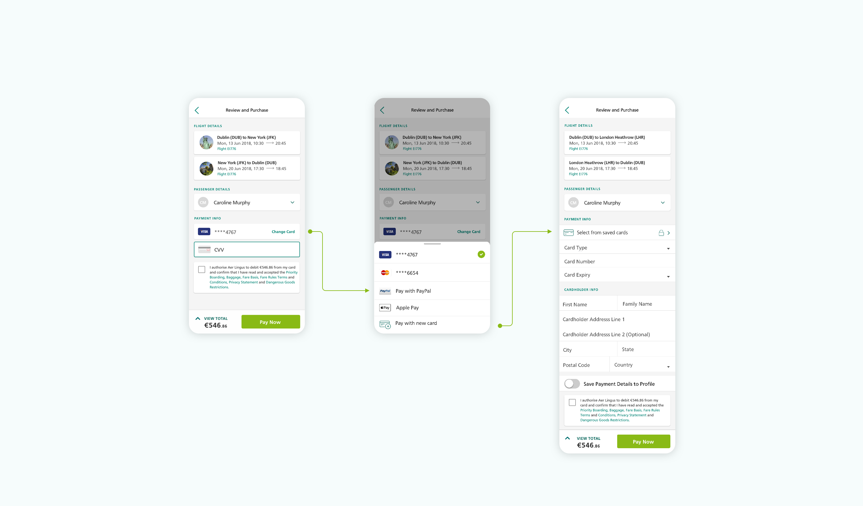
Conversion Flow Optimisation
Nearly 80% of online shoppers abandon their carts before ever completing a purchase, translating to significant lost revenue for businesses. Reducing the time and effort involved with completing a purchase significantly increases your conversion rate.
After attending the conversions@google conference I did a deep dive into the booking flow and removed unnecessary steps that added significant time to the booking flow. We also pre-filled as many details as possible to save the user time and effort and added smart ways to checkout including Apple Pay and PayPal.
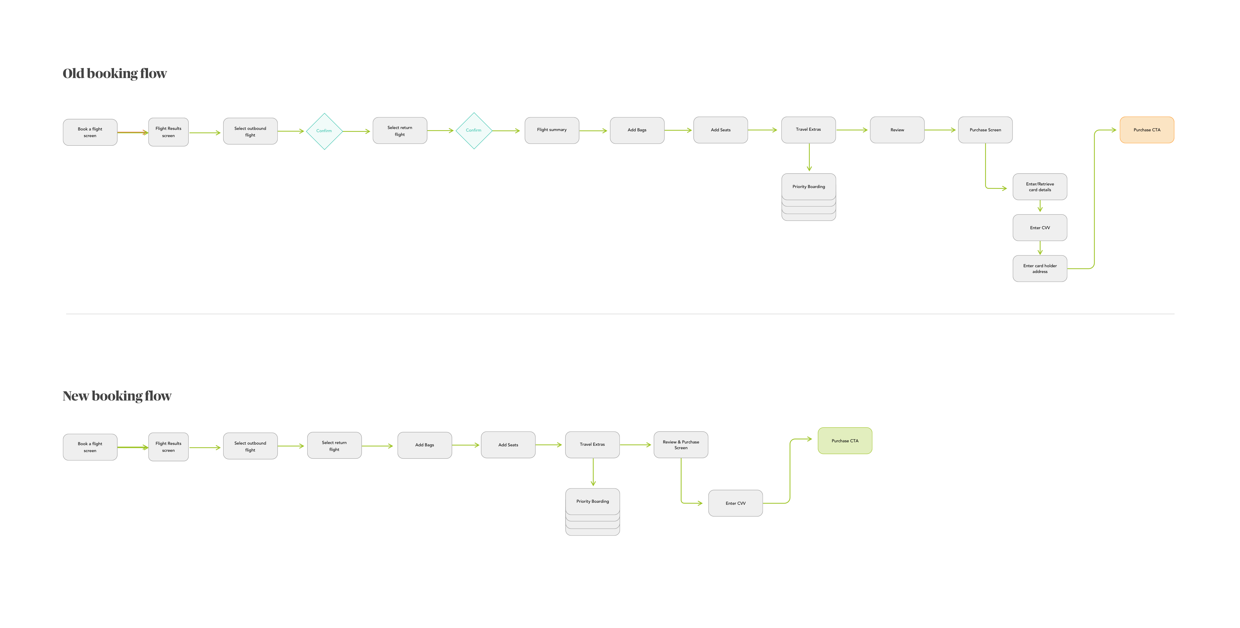
Review and Purchase Screen Optimisation
The final design of the Review and Purchase page. I consolidated two lengthy screens with lots of manual form filling into one simple screen. You can now complete your purchase in two easy steps.